
A custom 404 page
Because 'page not found' shouldn't mean 'design not applied'
- Published
- 27 August 2026
- Read time
- 9 min read
Was this useful?
A 404 page is easy to forget. You build the real pages, you wire up the routes, and the 404 sits at the bottom of the list — “I’ll do that later.” Later arrives when someone pastes a broken link, follows a dead URL from an old tweet, or misremembers your slug. What they see in that moment is not nothing: it is a page, it represents your site, and it should look like it belongs there.
In Astro, building one is trivial. The interesting part is the design.
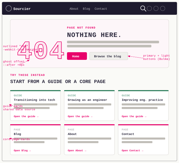
Click the expand icon to view it fullscreen.
How Astro handles 404s
Create a file at src/pages/404.astro and Astro will render it as /404.html in the static build output. Netlify serves that file automatically for any path that doesn’t match a real route. No configuration required — it works out of the box.
The page has access to everything a normal page does: layouts, components, styles, the full design system.
Skipping the standard layout
The first decision was whether to use the PageHero component that every other page uses. It gives you a kicker, a title, a subtitle, breadcrumbs, and optional cover image — which is fine for real content, but overkill for an error page. A 404 doesn’t need breadcrumbs. It doesn’t need a cover image. It needs to tell the user what happened and give them somewhere to go.
Dropping PageHero frees up the layout, but “somewhere to go” turned out to be more than one link. Rather than a single centred block, the page ended up as two sections: a hero panel that states the problem, and a grid of cards underneath that gives the visitor several concrete next steps.
The hero panel
The hero is a self-contained page-panel with a two-column grid on tablet and up: the outlined number on the left, the eyebrow, heading, copy, and buttons on the right. Below that breakpoint it stacks into a single column.
.not-found__panel { display: grid; gap: 1.5rem; align-items: center; background: radial-gradient( circle at top right, color-mix(in srgb, var(--accent-secondary) 14%, transparent) 0%, transparent 34% ), linear-gradient( 150deg, color-mix(in srgb, var(--accent-primary) 4%, var(--surface-elevated)) 0%, var(--surface-elevated) 62% ), var(--surface-elevated);
@media (min-width: 768px) { grid-template-columns: minmax(9rem, 0.6fr) minmax(0, 1.4fr); gap: 2rem; }}The gradients are subtle: a hint of the pink accent bleeding in from the left, a hint of the secondary green in the top-right corner, layered over the same --surface-elevated token every other panel on the site uses, so the page still looks like it belongs here rather than a one-off design experiment.
The number
The visual anchor is the “404” itself. The approach here is outlined text: transparent fill, a pink stroke, with a faint offset copy behind it to create a ghost effect.
.not-found__number { font-family: "Barlow Condensed", sans-serif; font-size: clamp(6rem, 18vw, 12rem); font-weight: 900; line-height: 0.9; letter-spacing: -0.03em; color: transparent; -webkit-text-stroke: 2px var(--accent-primary); position: relative;
&::after { content: "404"; position: absolute; inset: 0; color: rgba(var(--accent-primary-rgb), 0.07); -webkit-text-stroke: 0; transform: translate(6px, 6px); z-index: -1; }}-webkit-text-stroke has broad browser support and the effect is subtle enough that it degrades gracefully if it didn’t. The ::after pseudo-element repeats the text, shifts it six pixels, and uses a very low-opacity solid fill — it looks like a shadow but reads as intentional.
clamp(6rem, 18vw, 12rem) handles the responsive sizing without a media query: small on mobile, fluid in the middle, capped once the panel’s own column width takes over on wider screens.
The copy and the primary actions
Inside the right-hand column, there’s a small eyebrow above the heading, a two-line explanation, and two calls to action styled with the site’s existing Bulma button classes rather than anything bespoke:
<p class="not-found__eyebrow">Page not found</p><h1 class="not-found__heading">Nothing here.</h1><p class="not-found__sub"> That URL may have moved, been deleted, or never existed. Start from the homepage, jump into the latest writing, or pick the guide that matches where you are now.</p><div class="not-found__actions"> <a href="/" class="button is-primary is-medium">Home</a> <a href="/blog" class="button is-light is-medium">Browse the blog</a></div>“Nothing here.” is short deliberately. “Page not found” is accurate but passive, so it moved to a small uppercase eyebrow instead, and the <h1> gets to be the blunt version. The is-primary button (solid pink) covers the obvious escape route; is-light gives a lower-commitment second option for someone who just wants to keep reading.
Try these instead: guides and core pages
Two buttons cover the obvious cases, but a 404 is also a reasonable place to hand someone a menu. Below the hero panel sits a second section, labelled “Try these instead”, with a card grid mixing two sources:
- The site’s
audienceGuidesdata — the same array that powers the guide landing pages — mapped straight into cards. - A short, hard-coded list of core pages: Blog, About, Contact.
{audienceGuides.map((guide) => ( <article class="not-found-card not-found-card--guide"> <p class="not-found-card__eyebrow">Guide</p> <h3 class="not-found-card__title">{guide.title}</h3> <p class="not-found-card__body">{guide.summary}</p> <a href={guide.href} class="not-found-card__cta">Open the guide</a> </article>))}{corePages.map((page) => ( <article class="not-found-card"> <p class="not-found-card__eyebrow">Page</p> <h3 class="not-found-card__title">{page.label}</h3> <p class="not-found-card__body">{page.description}</p> <a href={page.href} class="not-found-card__cta">Open {page.label}</a> </article>))}Reusing audienceGuides instead of duplicating the guide titles and blurbs means the 404 page can’t drift out of sync with the guides landing page: if a guide is renamed or its summary is rewritten, this grid picks it up automatically. The two card types are visually distinguished by a thin top border: guide cards use --accent-secondary, core page cards use --accent-primary.
Accessibility notes
The number carries aria-hidden="true", since it’s decoration and the <h1> already says what happened, so a screen reader doesn’t need to announce “404” on top of “Nothing here.” Both sections use aria-labelledby pointing at their own heading id (not-found-heading, not-found-paths-heading) rather than a generic aria-label, so the accessibility tree gets the same heading text a sighted reader sees, instead of a second, possibly diverging, piece of copy to maintain.
Full code listing
---import BaseLayout from "../layouts/BaseLayout.astro";import { audienceGuides } from "../data/audienceGuides";
const corePages = [ { href: "/blog", label: "Blog", description: "Start with the latest writing and browse by topic.", }, { href: "/about", label: "About", description: "Find out who I help and the kind of work I do.", }, { href: "/contact", label: "Contact", description: "Get in touch about mentoring, consulting, or a question.", },];---
<BaseLayout pageTitle="Page not found — Sourcier" description="The page you're looking for doesn't exist."> <div class="not-found flow-section flow-section--loose"> <div class="container is-max-desktop"> <section class="not-found__hero" aria-labelledby="not-found-heading"> <div class="page-panel not-found__panel"> <div class="not-found__number" aria-hidden="true">404</div> <div class="not-found__copy"> <p class="not-found__eyebrow">Page not found</p> <h1 class="not-found__heading" id="not-found-heading"> Nothing here. </h1> <p class="not-found__sub"> That URL may have moved, been deleted, or never existed. Start from the homepage, jump into the latest writing, or pick the guide that matches where you are now. </p> <div class="not-found__actions"> <a href="/" class="button is-primary is-medium">Home</a> <a href="/blog" class="button is-light is-medium"> Browse the blog </a> </div> </div> </div> </section>
<section class="not-found__paths" aria-labelledby="not-found-paths-heading" > <p class="section-label">Try these instead</p> <h2 class="not-found__paths-heading" id="not-found-paths-heading"> Start from a guide or a core page </h2> <div class="not-found__grid"> { audienceGuides.map((guide) => ( <article class="not-found-card not-found-card--guide"> <p class="not-found-card__eyebrow">Guide</p> <h3 class="not-found-card__title">{guide.title}</h3> <p class="not-found-card__body">{guide.summary}</p> <a href={guide.href} class="not-found-card__cta"> Open the guide </a> </article> )) } { corePages.map((page) => ( <article class="not-found-card"> <p class="not-found-card__eyebrow">Page</p> <h3 class="not-found-card__title">{page.label}</h3> <p class="not-found-card__body">{page.description}</p> <a href={page.href} class="not-found-card__cta"> Open {page.label} </a> </article> )) } </div> </section> </div> </div></BaseLayout>
<style lang="scss"> .not-found { padding: 0 1.5rem; }
.not-found__panel { display: grid; gap: 1.5rem; align-items: center; margin-bottom: 3rem; background: radial-gradient( circle at top right, color-mix(in srgb, var(--accent-secondary) 14%, transparent) 0%, transparent 34% ), linear-gradient( 150deg, color-mix(in srgb, var(--accent-primary) 4%, var(--surface-elevated)) 0%, var(--surface-elevated) 62% ), var(--surface-elevated);
@media (min-width: 768px) { grid-template-columns: minmax(9rem, 0.6fr) minmax(0, 1.4fr); gap: 2rem; } }
.not-found__number { font-family: "Barlow Condensed", sans-serif; font-size: clamp(6rem, 18vw, 12rem); font-weight: 900; line-height: 0.9; letter-spacing: -0.03em; color: transparent; -webkit-text-stroke: 2px var(--accent-primary); user-select: none; position: relative;
&::after { content: "404"; position: absolute; inset: 0; color: rgba(var(--accent-primary-rgb), 0.07); -webkit-text-stroke: 0; transform: translate(6px, 6px); z-index: -1; } }
.not-found__eyebrow { margin: 0 0 0.65rem; font-family: "Barlow Condensed", sans-serif; font-size: 0.8rem; font-weight: 700; text-transform: uppercase; letter-spacing: 0.1em; color: var(--accent-secondary); }
.not-found__heading { margin: 0; font-family: "Barlow Condensed", sans-serif; font-size: clamp(2rem, 5vw, 3.5rem); line-height: 0.95; text-transform: uppercase; color: var(--text-primary); }
.not-found__sub { margin: 0.95rem 0 0; max-width: 58ch; line-height: 1.75; color: var(--text-muted); }
.not-found__actions { display: flex; flex-wrap: wrap; gap: 0.75rem; margin-top: 1.4rem; }
.not-found__paths-heading { margin: 0 0 1.5rem; font-family: "Barlow Condensed", sans-serif; font-size: clamp(1.8rem, 4vw, 2.5rem); line-height: 1.02; text-transform: uppercase; color: var(--text-primary); }
.not-found__grid { display: grid; gap: 1rem;
@media (min-width: 768px) { grid-template-columns: repeat(3, minmax(0, 1fr)); } }
.not-found-card { display: flex; flex-direction: column; gap: 0.85rem; min-height: 100%; padding: 1.4rem; border: 1px solid var(--border-subtle); border-top: 3px solid var(--accent-primary); border-radius: var(--radius-panel); background: linear-gradient( 160deg, color-mix(in srgb, var(--accent-primary) 4%, var(--surface-elevated)) 0%, var(--surface-elevated) 62% ), var(--surface-elevated); box-shadow: var(--shadow-panel); transition: transform 0.18s ease, box-shadow 0.18s ease, border-color 0.18s ease;
&:hover { transform: translateY(-3px); box-shadow: var(--shadow-lift); } }
.not-found-card--guide { border-top-color: var(--accent-secondary); background: radial-gradient( circle at top right, color-mix(in srgb, var(--accent-secondary) 12%, transparent) 0%, transparent 34% ), linear-gradient( 160deg, color-mix(in srgb, var(--accent-primary) 3%, var(--surface-elevated)) 0%, var(--surface-elevated) 62% ), var(--surface-elevated); }
.not-found-card__eyebrow { margin: 0; font-family: "Barlow Condensed", sans-serif; font-size: 0.78rem; font-weight: 700; letter-spacing: 0.1em; text-transform: uppercase; color: var(--text-muted); }
.not-found-card--guide .not-found-card__eyebrow { color: var(--accent-secondary); }
.not-found-card__title { margin: 0; font-family: "Barlow Condensed", sans-serif; font-size: 1.15rem; line-height: 1.05; text-transform: uppercase; color: var(--text-primary); }
.not-found-card__body { margin: 0; line-height: 1.65; color: var(--text-muted); }
.not-found-card__cta { margin-top: auto; display: inline-flex; align-items: center; padding-block: 0.75rem; font-family: "Barlow Condensed", sans-serif; font-size: 0.86rem; font-weight: 700; letter-spacing: 0.08em; text-transform: uppercase; color: var(--accent-primary); text-decoration: none; }
.not-found-card--guide .not-found-card__cta { color: var(--accent-secondary); }</style>What Netlify does with it
Netlify serves 404.html for any unmatched route. No netlify.toml redirect rule needed, no custom headers — it just works. Deploy it and broken links get your page instead of the browser default.
Working on something similar?
Need help raising the bar?
I help teams improve engineering practice through hands-on delivery, pragmatic reviews, and mentoring. If you want a second pair of eyes or practical support, let's talk.
- Engineering practice review
- Hands-on delivery
- Team mentoring
If this has been useful, you can back the writing with a one-off tip through a secure Stripe checkout.
Free · Practical · One email per post
Get practical engineering notes
One short email when a new article goes live. Useful if you are breaking into tech, growing as an engineer, or improving engineering practice on your team.
Comments
Loading comments…
Leave a comment